
The Galaxy Manifold
Published:
Last Thursday I was surprised that my calendar showed—for the first time in several weeks—zero meetings! I told everyone that I was taking the day off and decided to go hiking. By the time I crossed the Mile 2 marker of the NCR Trail, I was half-consciously thinking about students and education and AI in science/math and the accelerating pace of research. And I found myself wondering, what was the best use of my time as a PhD student?
The answer was obvious: Looking at data.1 Visualizing data to build all of the astrophysical intuitions I would need to do my profession well. Wrangling data to understand correlations, selection biases, spurious signals, astrophysics. Testing data by fitting physical and statistical and machine learning models.
It became apparent to me that AI tools could enrich astronomical data by joining together datasets, presenting them in new ways, and empowering users to navigate the datasets more fluidly. Most importantly, AI could build out such tools without compromising the learning process for students. The important part is to maximize the time students engage with the data. Other astronomy visualization tools like the SAO’s ds9 or CARTA havve the same goal.
I had also come up with an ideal use case: the multitude of galaxy scaling relations. Researchers typically characterize these scaling laws that describe how galaxy properties are correlated as galaxies grow, such as the mass-metallicity relation (MZR), or the size-mass relation, or the star forming “main sequence” of galaxies. But more parameters can be added to reduce the scatter, e.g., forming the fundamental plane or the fundamental metallicity relation! Galaxy scaling relations among N observables implies that there are actually fewer than N degrees of freedom. Intuitively, we know this means that galaxies actually live on a low-dimensional manifold even when we plot them in a high-dimensional space.
Designing the visualization tool
After a few hours of hiking and mulling over these thoughts, I couldn’t wait to build this tool. (And if you can’t wait to see it, just skip down to the next section, or view it directly!) I had settled on some core design principles, primarily aimed at enhancing astronomers’ intuition rather than replacing it with AI:
- Center the data. Focus on the galaxy manifold, letting users build intuition from what they see. Do not over-explain or offer interpretations.
- It should be easy to show three parameters on the x, y, and color axes.
- We should be able to seamlessly display galaxy image cutouts. Those cutouts display a ton of visual information that cannot be easily summarized by a small number of parameters.
- Empower navigation. Make it easy for the user to navigate the data manifold, whether that’s through ergonomic scrolling, panning, or rotation through this high-dimensional galaxy manifold.
- One example here is The Grand Tour (credit to Asimov!), a mode that begins randomly rotating through 2D views in a high-dimensional space of galaxy properties.
- You can use a lasso tool to draw a selection of galaxies and show all of their image cutouts and/or the subsample’s statistics over all parameters.
- Equip power users. Unlike many apps that prioritize minimal user interfaces but present only a shallow view, the Galaxy Manifold web app should be loaded with tools for power users. The more you know about galaxy evolution, the more capable you should feel.
- For example, you can impose multiple filters on the data while cycling through multiple views.
- There is a feature to minimize the scatter along the y axis by taking a linear combination of features (projected along the x axis). This is analogous to how the fundamental metallicity relation was discovered.
- There are keyboard shortcuts!
- Connect data with astrophysics. Data provenance, empirical relations, and theoretical predictions should all be shown side by side.
- The Sloan Digital Sky Survey (SDSS) Main Galaxy Sample is perfect for a few reasons: it is well-studied, it has a homogeneous selection criterion (r < 17.77), it has both imaging and optical spectra, and it is mostly limited to low-redshift objects (which imposes some bound on the rest-frame wavelengths and angular sizes).
- A vital feature is being able to crossmatch this large SDSS sample against other important datasets (e.g., radio-wavelength catalogs, environmental catalogs, citizen science morphology labels, etc).
- I thought it was vital to show image cutouts, with an “inspector” service that links to other surveys (like DESI Legacy Imaging Surveys and SDSS cutouts and spectra), but in a way that was snappy and didn’t require loading GB of data. I instead chose random representative images using K-means and compressed them so that they can load quickly.
With all of these ideas in mind, and many more,2 I turned to the freshly released Claude Opus 5.5 and delivered my instructions.
And lo, the Galaxy Manifold
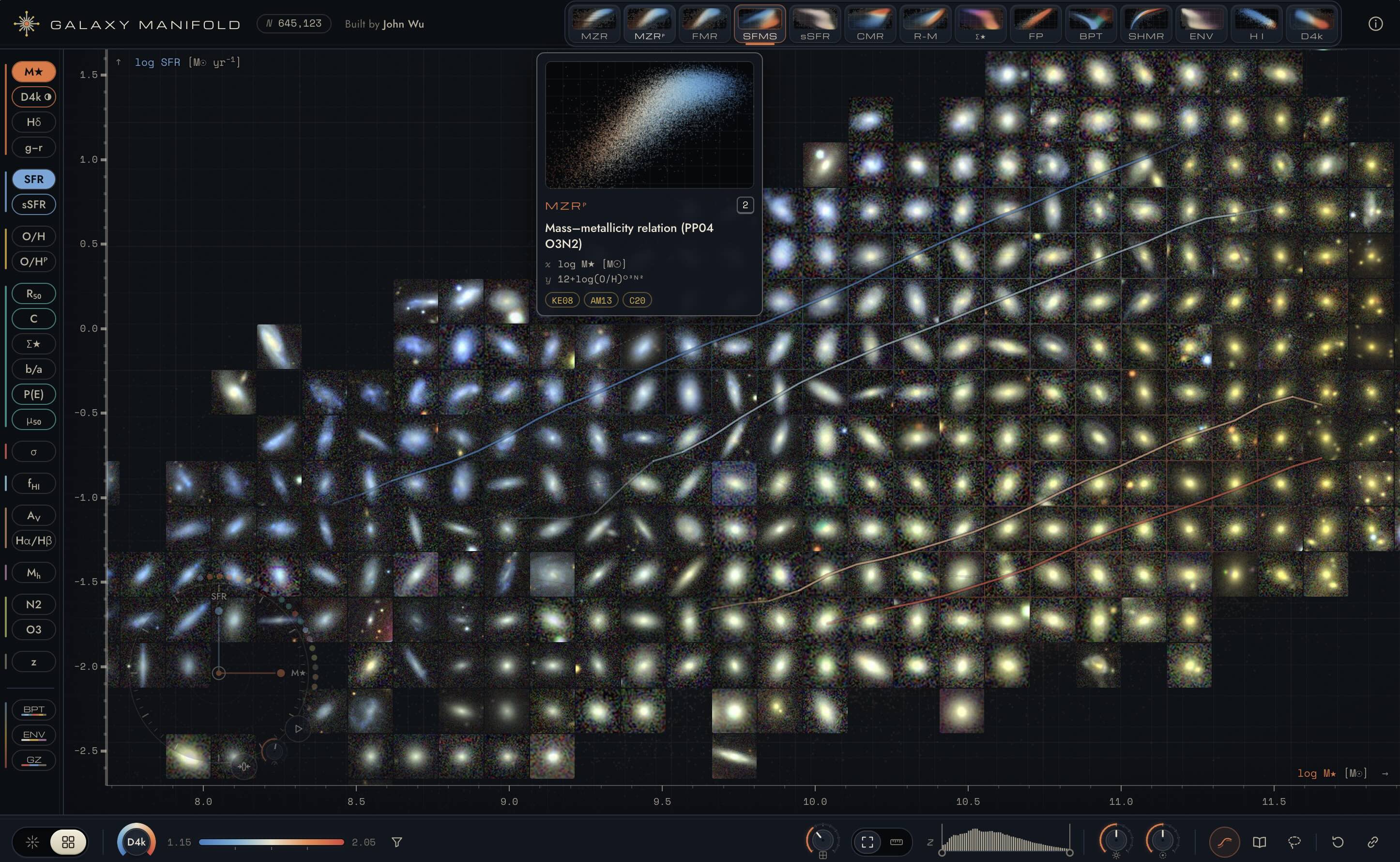
There is no single canonical way to view the Galaxy Manifold app, so all I can say is that you gotta play around with it. Not sure where to start? Fine, I’ll hold your hand; here are some instructions (geared for computer use, not the mobile view).
- Open up the default view, which should be on the star-forming main sequence, colored by Dn4000, the 4000 Angstrom break strength.
- Press
m, or look at the toggle in the lowest, left-most corner. This will show image cutouts. - In that bottom panel, look to the right, past the colorbar, until you see a dial and another toggle. Click on the dial and slide up/down to adjust the size of the cutouts.3 Click on the toggle to go from apparent sizes to physical galaxy sizes.
- Let’s revert to the grid-points view because this gives us our color axis back. (Remember you can just press
magain.) Let’s also toggle off the literature scaling relations by pressingb. - Try selecting a subpopulation of galaxies using the lasso tool, which you can do in the lower right-side corner or by pressing
l. This opens up the selector panel on the right-hand side: you can see image cutouts, as well as galaxy property distributions along all the different axes! Pressescto remove the selection, or find the null symbol and click it. Presslagain to turn off the lasso tool. - Did I mention that you can just hover your mouse over a point to see image cutouts pop up? Clicking one will bring up the inspector tool, which shows a live image cutout from the Legacy Imaging Surveys viewer. If you scan along the upper toolbar of the inspector view, then you will also find links to the SDSS SkyServer spectrum viewer tool.
- By now you must be wondering what that circular-looking compass tool is in the lower left corner. If you guessed that it sets the axes of the plot (i.e., by default plotting SFR vs stellar mass), then you’d be correct! You can actually grab the handle (the colored circle) of one of those axes and drag it around to start rotating it. This is how you navigate and rotate in the displayed dimensions.
- See those other small colored circles displayed around it? Pick one—let’s say the concentration (c)—and drag it onto the compass system. Now you have three dimensions displayed at once (example)! A handy way to explore here is to drag one of these three axes using small movements, causing a sort of parallax to help guide the eye.
- Want to quickly change the x, y, or color axes? Click on one of the galaxy properties from the left-side, and select the axis you want.
- If you color by an axis that has lots of missing values, then they’ll show up as a beige color. No worries! You can press
vor click on the filter symbol by the color bar to remove them. - Going back to the compass, you should try clicking the “play” button. This starts the grand tour: rotating randomly through the high-dimensional galaxy manifold! You can add properties to the grand tour through the left sidebar. (To start/pause the tour, you can also press
space, but this doesn’t work reliably on all browsers.) - Want to see the known scaling relations? Click one of the preset views defined in the top row.
- Feel like changing the redshift range? The middle of the bottom panel will help you out. You can drag the left and right edges to define a redshift interval, and then click and drag that distribution to shift it. Double click it to reset it. (In fact, double clicking is a general reset strategy: double-clicking the dials will bring them to their defaults, and double-clicking the handle on the compass will remove that axis from the manifold projection.)
Didn’t quite follow along? You can press ? or click the information button in the top right corner for lots more details! There are lots more features that I didn’t describe here; hopefully you’ll enjoy all the little easter eggs.
Go forth and do science
I’ve already received some great feedback on the Galaxy Manifold app. A not insignificant fraction have remarked that this must’ve taken you so long to build. On one hand, the app is based on ideas and intuitions that have been marinating in my brain for over a decade.4 On the other hand, I took a day off to go hiking, realized that I had to implement this idea, sent it off to Claude at 2pm, then went to Max’s Taphouse to taste test this year’s Oktoberfest beers,5 and finally iterated on it during some spare time that evening in between cooking dinner and putting my kids to bed. All that to say, the entire process took less than a day. I had a working prototype within four hours of firing off my first prompt to Claude, and I “shipped” the web app in about eight hours.
My hope is that this tool will help astronomers—and especially students—spend more time looking at their data. I used AI to build this tool in order facilitate data exploration and visualization, so that users can spend more time thinking about science, rather than outsourcing their thinking to AI.6
Tell me if you discover anything cool!
As an observational astronomer, my data were telescope observations. But I think that “looking at data” is essential for theorists as well—it’s just that their data are more like ideas or symbolic expressions rather than detector pixels or galaxy spectra. ↩
You can see these in the Github repository’s DESIGN.md page, which was spelled out based on an “interview” conducted by Claude Opus 5.5. ↩
This is the one design flaw that needs to be fixed. The dial looks nice with the current theme, but the navigation is actually an up/down slider. Sigh. ↩
I remember telling one of my collaborators many years ago that my post-tenure ambition was to write down the true intrinsic dimensionality of the galaxy manifold. This isn’t a ground-breaking idea, but I think we’re one step closer now to realizing it! ↩
Unsurprisingly, Ayinger is very hard to beat. ↩
If you want to read more on this line of thinking, then you might like my previous posts describing my slow growth and reflecting on my first two years as a tenure-track researcher. ↩